25+ Students
Creative Cohort
Junior high students learning visual design hierarchy
How teaching digital composition in Figma helped students discover that good design is about visual clarity, not decorative excess.
"Good design isn't about making things loud; it's about making information clear, respectful, and effortless to understand."
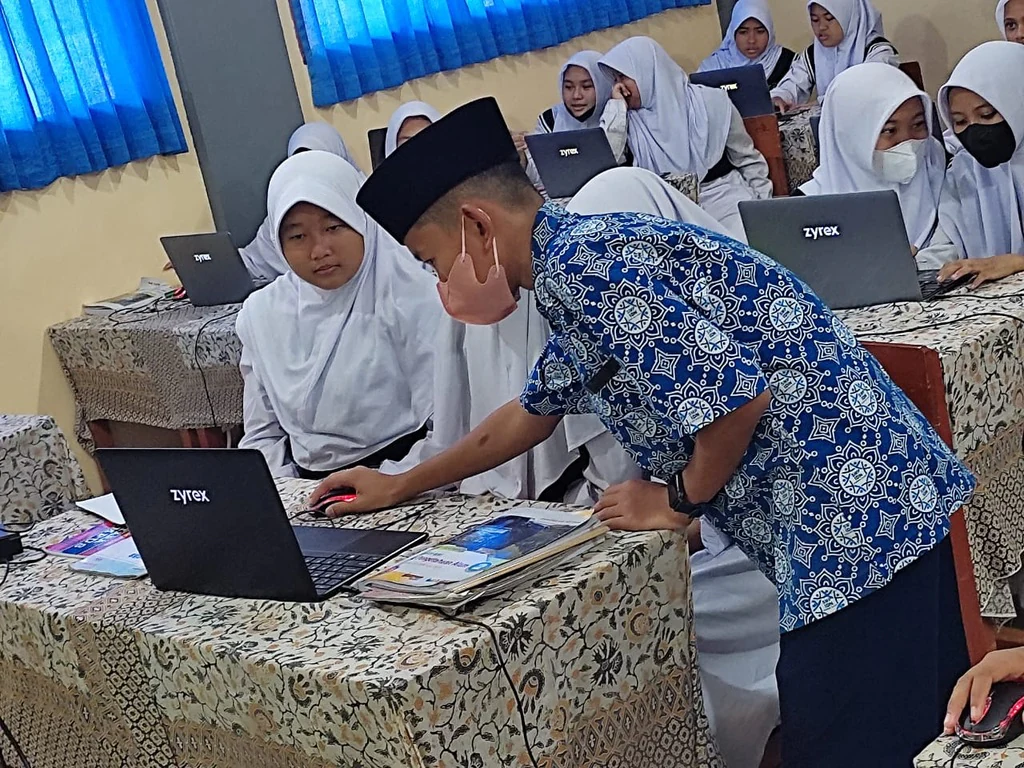
Middle school students often believe that a good poster must use every font and color available. At MTs Yasmine, I introduced the '3-Second Rule': if a passerby cannot identify what event is happening and when within three seconds, the design has failed. We examined real-world posters together, analyzing how headline size, white space, and high contrast guide the viewer's eyes naturally.
Using Figma's vector alignment tools and typography controls, each student built their own promotional poster for a fictional school festival or community cause. Helping them limit their color palettes to three harmonious tones immediately elevated their work from chaotic to professional.
A structured 3-part guide to visual communication, layout grids, and modern digital poster composition.
Understanding how the human eye scans information, focal points, and prioritizing essential headlines over background clutter.
Pairing heading and body typefaces, managing line spacing, and selecting 3-color palettes with high legibility.
Sourcing royalty-free vectors, masking imagery cleanly, and exporting high-resolution digital files for print and web.
Lessons on simplifying visual communication for young creators.
Teaching young students to embrace white space rather than filling every pixel showed that clarity requires knowing what to leave out.
Learning how to organize visual information at fourteen gave me an immense competitive advantage when building frontend web interfaces years later.
Photographic archives documenting digital design training sessions at MTs Yasmine.
Explaining typography hierarchy, grid alignment, and visual balance on the whiteboard and classroom projector.